Pattern Recognition 2023
https://doi.org/10.1016/j.patcog.2023.109600
This is an annotated version of the published manuscript.
Annotations are set as sidenotes, and were not peer reviewed (nor reviewed by all authors) and should not be considered as part of the publication itself. They are merely a way for me to provide some additional context, or mark links to other publications or later results. If you want to cite this article, please refer to the official version linked with the DOI.
Adrien Foucart
Biomedical image analysis competitions often rank the participants based on a single metric that combines assessments of different aspects of the task at hand. While this is useful for declaring a single winner for a competition, it makes it difficult to assess the strengths and weaknesses of participating algorithms. By involving multiple capabilities (detection, segmentation and classification) and releasing the prediction masks provided by several teams, the MoNuSAC 2020 challenge provides an interesting opportunity to look at what information may be lost by using entangled metrics. We analyse the challenge results based on the “Panoptic Quality” (PQ) used by the organizers, as well as on disentangled metrics that assess the detection, classification and segmentation abilities of the algorithms separately. We show that the PQ hides interesting aspects of the results, and that its sensitivity to small changes in the prediction masks makes it hard to interpret these results and to draw useful insights from them. Our results also demonstrate the necessity to have access, as much as possible, to the raw predictions provided by the participating teams so that challenge results can be more easily analysed and thus more useful to the research community.
Challenge ,Competition ,Digital pathology ,Image analysis ,Performance metrics
Medical imaging has become an increasingly important part of diagnosis and clinical decision making. The workload of physicians involved in the analysis of these images has increased accordingly. The need for accurate and reliable algorithms capable of reducing that workload has led to the development of a large corpus of research in tasks such as detection, segmentation and classification of objects of interest in biomedical images. The first "grand challenge" in biomedical imaging was organized at MICCAI 2007, comparing algorithms for liver segmentation in CT scans [1]. It used a mix of volumetric overlap and surface distance metrics combined into a single score to produce an overall ranking. Since then, many such challenges have been organized on a diverse set of tasks, modalities and organs. Many of these challenges are referenced on the https://grand-challenge.org/ website.
Following the development of imaging devices for whole histological slides, digital pathology needs have motivated many challenges in recent years, starting in 2010 with the “Pattern Recognition in Histopathological Images" challenge hosted at ICPR [2], which tested algorithms on lymphocytes segmentation and centroblast detection, and reported several metrics for each task. These needs include the detection and identification of specific cell types or structures in thin sections of tissue samples (i.e. histological slides) and are important for various tasks in pathology, such as cancer diagnosis, prognosis and research. In digital pathology challenges, participants are usually given images of stained histological slides with annotations related to the task at hand to train their algorithms (as illustrated in Figure 1). Typically these challenges rank the participating teams on the basis of a single metric assessing the predictions made by their algorithm on an independent test set. This metric may combine evaluations of different subtasks needed to achieve the challenge objective. While this approach is useful for declaring a single winner, it makes it difficult to assess the strengths and weaknesses of the participating algorithms : for way more details on digital pathology challenges and their shortcomings, see our CMIG paper and/or chapter 3 of my dissertation. --AF .
Recently, the MoNuSAC2020 (Multi-organ Nuclei Segmentation and Classification) challenge was held as a satellite event of the ISBI 2020 conference. In this challenge, participants were provided with images of haematoxylin and eosin (H&E) stained histological sections from four organs. These H&E images were accompanied by annotations segmenting and identifying four cell types, namely epithelial cells, lymphocytes, macrophages and neutrophils. Based on this data set, the participants were asked to develop algorithms to recognise these cell types. These algorithms were then to be evaluated on a new set of test images from other patients. As detailed below, the submitted results were assessed using a single metric based on the Panoptic Quality (PQ) and ranked accordingly. These results were published on the challenge website hosted at grand-challenges.org1, and in 2021 in the IEEE Transactions on Medical Imaging [3]. The training and testing data were fully released to the public, including all annotations. Code for reading the .xml annotations and for computing the challenge metric was also released in a GitHub repository2. Remarkably, they also released the test set predictions of the top five teams from the challenge leaderboard. This is a unique level of transparency for a digital pathology challenge.
In this work, we use the opportunity offered by the available data from the MoNuSAC2020 challenge to illustrate how the use of a single, aggregated metric obscures important information that could be derived from the results if the different components of the metric were kept separate. We show that the use of multiple metrics, specific to each of the tasks involved in the challenge, allows us to better identify the strengths and weaknesses of each competing algorithm. We also analyse the robustness of the metrics to small changes in the annotations that would have no impact on the application of the results in clinical pathology. Supplementary material and supporting code are available at: https://github.com/adfoucart/disentangled-metrics-suppl.
This article is structured as follows. In section 2, we discuss some related works on evaluation metrics. In section 3.1, we present the dataset and the definition of the Panoptic Quality used in the MoNuSAC2020 challenge. In section 3.2, we describe the experiments performed for our analysis. In section 4, we report our results on the robustness of the PQ metric (4.1) and on the effect of decomposing it into its base components, i.e. detection quality and segmentation quality (4.2). We end by the results provided by fully separated classification, detection and segmentation metrics (4.3). In section 5, we discuss our results and the limitations of the PQ metric (5.1), the insights we can gather from disentangled metrics (5.2), and the limitations of our study (5.3). A conclusion is provided in section 6.
Maier-Hein et al. completed a large survey and analysis of biomedical imaging challenges [4]. They demonstrate how small changes in challenge metrics, ranking mechanism, aggregation method and expert selection for reference annotations can lead to large changes in the ranking of the algorithms. This study led to the publication of guidelines for challenge organizers [5] to ensure better interpretation and reproducibility of the results.
Luque et al. [6] studied more specifically the impact of class imbalance on binary classification metrics : a study which I extended to the multiclass case in chapter 4 of my dissertation. --AF . The study demonstrates how commonly used metrics such as the F1-score, precision and Negative Predictive Value are highly biased when used on imbalanced datasets. The least biased metrics are shown to be the specificity and sensitivity. If a single metric is required, the geometric or arithmetic mean of these two values are also unbiased. The Matthews Correlation Coefficient is also shown to be a good alternative, ahead of the Markedeness metric and finally the Accuracy, even if this latter is balanced [7]. In contrast to the binary case, it should be noted that very little data is available in the literature on multi-class classification metrics [8], except perhaps on the defects of Cohen’s Kappa [9].
Limitations of commonly used segmentation metrics are also explored by Reinke et al. [10]. The study shows the main properties and biases of three of the most common segmentation metrics: the Dice Similarity Coefficient (DSC), Intersection over Union (IoU), and Hausdorff Distance (HD). The DSC is found to be unsuitable in many cases, as it is highly unstable for small objects : like, for instance, a cell nucleus... --AF , and does not penalize under- and over-segmentation in the same way. The unbounded nature of the HD, meanwhile, leads to very arbitrary decisions when deciding for instance how to aggregate multiple cases when there are missing values, with potential effects on ranking. Combining different metrics into a single ranking is also shown to be difficult, as many metrics are mathematically related, and therefore the choice of which metrics are combined can reinforce biases.
Padilla et al. [11] compared the most commonly used detection metrics. Their study lists 14 different metrics used in challenges, mostly based on precision and recall. The main differences come from how matching objects are defined (usually with a threshold on the IoU between the predicted bounding box and the ground truth bounding box), and how the precision and recall are combined into a single score.
A survey of digital pathology challenges in particular has been done in Hartman et al. [12]. The study notes the difficulty of finding good metrics for digital pathology challenges, as well as the difficulty of determining a "ground truth" in such images. This question of how the notion of “ground truth” can really be applicable for computing metrics in digital pathology, where inter-expert disagreement is generally high, has been discussed in our previous work [13] using the annotations provided by the Gleason2019 challenge.
These studies provide a theoretical background on the particular weaknesses of some metrics, and demonstrate that these can affect the rankings of challenges, which are used to inform our understanding of which algorithms are best for solving the underlying tasks. In this work, we will look more particularly at the problems that come from attempting to measure subtasks which are inherently independent with a single aggregating metric, and at the loss of useful information that this aggregation represents.
A description of the challenge datasets, the organization of the competition, and the evaluation metrics was provided ahead of the challenge in [14]. A post-challenge report containing information on the competing algorithms and a discussion of the methods used and of the challenge results was published in [3]. The challenge dataset was composed of H&E-stained tissue images acquired from several patients at multiple hospitals, and from four different organs, at 40x magnification. The whole slide images (WSI) were selected from the TCGA database, then cropped and manually annotated by “engineering graduate students” with quality control performed by “an expert pathologist with several years of experience,” with a process of iterative revisions until “less than 1% nuclei of any type had any [missed nuclei, false nuclei, mislabelled nuclei, and nuclei with wrong boundaries].” The four classes of nuclei considered are “epithelial,” “lymphocytes,” “macrophages” and “neutrophils.” The training dataset contained cropped WSI regions (i.e. sub-images) from 46 patients, and the test data sub-images from 25 other patients. More than 30,000 nuclei were annotated in the training set, and more than 15,000 in the test set, with a large imbalance between the classes (around 30x as many epithelial/lymphocytes as macrophages/neutrophils). Some image aeras in the test set were also marked as “ambiguous,” with either “very faint nuclei with unclear boundaries” or “uncertainties about the class,” and excluded from the evaluation metrics.
The evaluation criterion differs slightly between the pre-challenge [14] and post-challenge [3] publications. In both cases, the “panoptic quality” (PQ) is used [15]. The PQ is determined per image and per class (\(c\)), as:
\[\label{eq:pq} PQ_c=\frac{\sum_{(p_c,g_c) \in TP_c} IoU_{(p_c,g_c)}}{|TP_c| + \frac{1}{2} |FP_c| + \frac{1}{2} |FN_c|}\]
A true positive (TP) is found when a predicted object (\(p\)) and a ground truth object (\(g\)) of the same class (\(c\)) have an intersection over union (IoU) strictly greater than 0.5. The PQ of a class for an image is therefore the average IoU of these true positives (in other words: the segmentation quality of the matched objects), multiplied by the detection F1-score for that class (FP = false positive, FN = false negative and \(|.|\) means “number of”).
In the present study, we use the overall metric described in the post-challenge publication [3], with [eq:pq] computed per patient and per class. For that purpose, the \(TP_c\) (matching pairs), \(FP_c\) (unmatched predictions), \(FN_c\) (unmatched ground truth) and \(IoU\) values for matching pairs are first aggregated for all sub-images of the same patient (corresponding to regions extracted from the same histological slide). The \(PQ_c\) are then averaged per patient over all classes (without class weighting), and finally averaged over the patients in the test set to obtain the final metric.
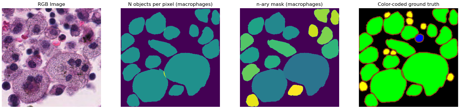
The ground truth annotations are provided as .xml files with each annotation encoded as a polygon with the position of the vertices. For each sub-image, participants were asked to provide their predictions as “n-ary masks,” with a separate file per class such that “all pixels that belong to a segmented instance should be assigned the same unique positive integer (\(>0\))” [14]. The “n-ary masks” were not directly released by the challenge organizers. Instead, color-coded prediction maps were released for the “top 5 teams” of the challenge. A wide border was added to all objects in these maps so that we can better see if the algorithm managed to separate close or partially overlapping objects (see Figure 1). The available data is therefore not identical to what was used to evaluate the challenge, as the borders introduce an uncertainty on the exact shape and boundaries of the predicted objects.
Other technical issues further complicate the reproduction of the challenge results. Only four of the top-five teams’ predictions can be retrieved because two of the provided links point to the same files and thus miss the challenge winner. The ground truth annotations sometimes contain overlapping boundaries. The PQ metric, according to the code provided by the challenge organizers, is however computed on the “n-ary masks,” which cannot possibly encode overlaps. The code provided to read the .xml annotations and produce the “n-ary masks” appears to simply assign the overlapping pixel to the last encountered object that covers it3. This overlap problem is illustrated in Figure 1. Finally, some contours encoded in the xml annotations have no inner pixels and completely disappear from the rasterization using the provided code, which relies on the draw module from the scikit-image library. This only happens to a handful of objects in the test set (4/7213 epithelial cells, 3/7806 lymphocytes, and none of the neutrophils and macrophages), so the impact is very limited and can be considered negligible.
Of a much more problematic nature are several errors in the implementation of the evaluation, which we detail in a comment article to the challenge’s publication [16] (which did not address the limitations of the metric itself). Because of these errors, we will use our re-implementation of the evaluation4 as a baseline for the interpretation of the results, rather than the challenge’s published leaderboard.
Using the color-coded predictions of the four available teams, and the n-ary masks generated from the .xml ground truth annotations, we performed several experiments to examine the robustness of the PQ metric and what kind of information may be hidden in the aggregation of the PQ metric.
We need to regenerate the n-ary masks from the provided colour-coded predictions in order to calculate PQ. This gives us the opportunity to test the robustness of the metric to small changes in the annotations, without impact on clinical application of the results (see Figure 2). These changes are induced by two slightly different mask generation methods:
A “border-removed” version, where all the pixels color-coded as borders are simply removed from the masks, resulting in non-contact masks separating objects, which are labelled according to their class using a simple connected component rule.
A “border-dilated” version, where the masks obtained in the first version are dilated by one pixel, in order to recover some of the pixels lost when removing the borders and to propose masks that should be closer to the actual prediction masks sent by the teams.
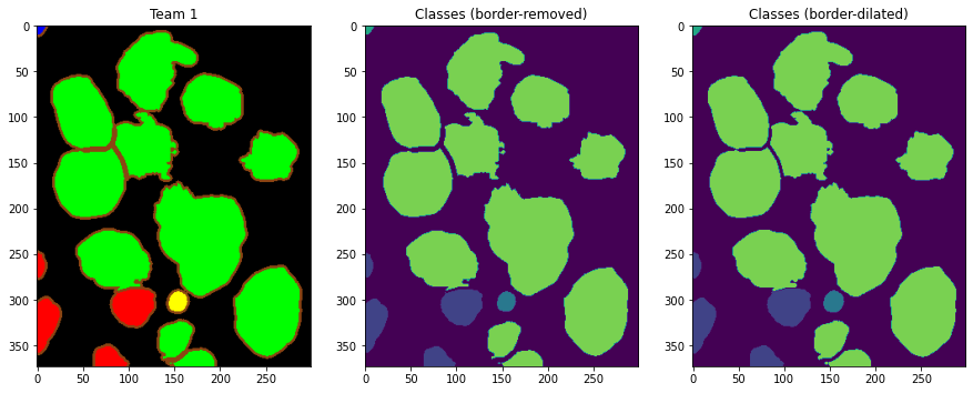
These “restored” masks are computed for the four available teams’ predictions, and also on the color-coded version of the ground truth. PQs are then computed between the two versions of the restored masks and the n-ary masks generated directly from the .xml annotations.
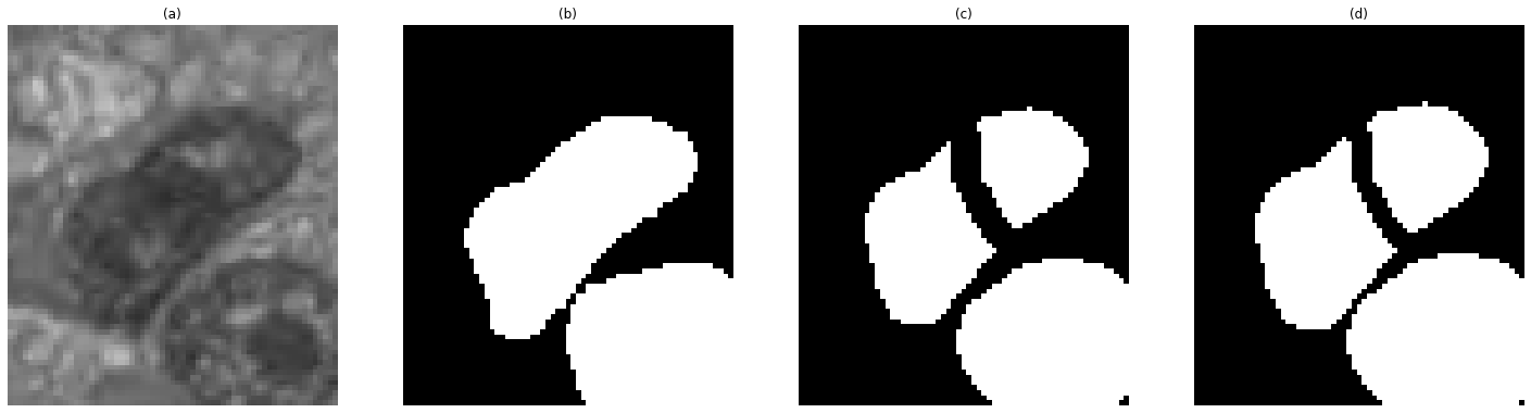
The rule proposed by the challenge to indicate a “match” is to look for pairs of segmented and ground truth objects with IoUs strictly above 0.5. This, however, may cause some problems, particularly in cases of over-segmentation, as shown in Figure 3, where a one-pixel change in the border of the objects leads to one true positive and one false positive turning into one false negative and two false positives because for one of the over-segmented objects the IoU decreases below the 0.5 threshold. That is why we include another matching rule in our experiments. This rule looks for the matching pair with the highest IoU among all possible pairs, and considers a true positive if the centroid of the predicted object is inside of the ground truth object. This rule does not reject pairs based on a bad segmentation when a match exists in the “detection” sense : a bit weirdly phrased I think. In other words: if something can reasonably be counted as a detection hit, even poorly segmented, we want to record it as a match. --AF .
The PQ, as we mentioned above, is a composition of the “Segmentation Quality” (SQ) and “Detection Quality” (DQ), such that, for each class (\(c\)) in each image:
\[\label{eq:sq} SQ_c = \frac{\sum_{(p_c,g_c) \in TP_c} IoU(p_c, g_c)}{|TP_c|}\] \[\label{eq:dq} DQ_c = \frac{|TP_c|}{|TP_c|+\frac{1}{2}|FP_c|+\frac{1}{2}|FN_c|}\] \[\label{eq:pq_dq_sq} PQ_c = DQ_c \times SQ_c\]
With the SQ corresponding to the average IoU of the matching pairs of objects, and the DQ to the detection F1-score. To gain better insights on the results given by the overall PQ, we decomposed it into its two separate components. Instead of averaging over the 25 patients of the test set, we look at the distribution of the 25 patient scores to compare the teams’ results more objectively.
Based on the challenge’s description and evaluation, we can identify three separate tasks that must be performed by the competing algorithms: nuclei detection, classification and segmentation. The PQ metric transforms this problem into four separate detection and segmentation tasks (one for each class), whose results are averaged for each patient into a single score. The metric prevents any distinction between an algorithm that detects nuclei, but assigns them wrong classes, and an algorithm that does not detect the nuclei correctly at all. It also does not take into account the segmentation quality of the misclassified objects into its segmentation score. To hightlight these potential differences, we compute separate metrics for the three different tasks.
Detection. For this task, we treat the problem as single-class and look at nuclei detection, regardless of the predicted class. Most detection metrics are based on the "area under the ROC curve" which requires knowledge of the confidence levels of the predictions to calculate precision and recall at different confidence thresholds [11]. As these data are not published for the challenge, we only compute a single precision and recall measure for each team, as well as the resulting F1-score.
Classification. For this task, we look at all the correctly detected nuclei, and compute the confusion matrix (CM) of the nuclei classification and its normalized version (NCM) to remove the impact of class imbalance when computing other metrics. If \(CM_{i,j}\) is the number of objects of ground truth class \(i\) predicted as class \(j\), then \(NCM_{i,j} = \frac{CM_{i,j}}{\sum_k CM_{i,k}}\). For a general view of the classification performance, we compute the overall NCM accuracy, also known as balanced accuracy, which is the arithmetic mean of the recall of each class. To get more insights on class-specific performance, we also compute the per-class precision, recall and F1-score, each time considering one class versus all others.
Segmentation. For this task, we again look at all the correctly detected nuclei, and compute the IoU between the predicted segmentation and the matched ground truth mask, regardless of the predicted class. We also look at the per-class IoU, where each matching pair of objects is counted towards the IoU of the ground truth class. Additionally, as the IoU is sensitive to the area overlap but not so much to the shape differences, we compute the Hausdorff Distance (HD) between matching pairs of objects, computed as the maximum distance between any point in the contour of an object and the nearest point on the contour of the other.
All of these metrics are computed per patient so that we can examine and statistically compare the distributions of results obtained on the test set by the algorithms. We also exclude all regions marked as “ambiguous” from the computations, as in the challenge.
In this section, we will present the results of the different experiments, and point out the most interesting insights that they offer. A more general discussion of these results will be done in the next section. The four teams for which the predictions were available5 are, by alphabetical order, “Amirreza Mahbod” (hereafter Team 1), “IIAI” (Team 2), “Sharif HooshPardaz” (Team 3) and "SJTU 426" (Team 4). As a reminder, the metric values reported in this section were computed using our re-implementation of the post-challenge rule (see section 3.1).
For brevity and clarity’s sake, it is sometimes inconvenient to report the results obtained under the four conditions tested (border-removed versus border-dilated masks and strict IoU versus centroid rule matching). In those cases, the “border-dilated, strict IoU" condition will be reported, as it is the one that most closely matches the condition of the original challenge. Results that are omitted here are available in the supplementary materials on GitHub.
| PQ (Rank) | Border-removed | Border-dilated | ||
| Strict-IoU | Centroid | Strict-IoU | Centroid | |
| Team 1 | 0.559 (2) | 0.574 (1) | 0.572 (1) | 0.586 (1) |
| Team 2 | 0.545 (3) | 0.562 (3) | 0.561 (2) | 0.574 (2) |
| Team 3 | 0.541 (4) | 0.554 (4) | 0.504 (4) | 0.516 (4) |
| Team 4 | 0.560 (1) | 0.568 (2) | 0.555 (3) | 0.561 (3) |
| Color-coded GT | 0.892 | 0.892 | 0.913 | 0.913 |
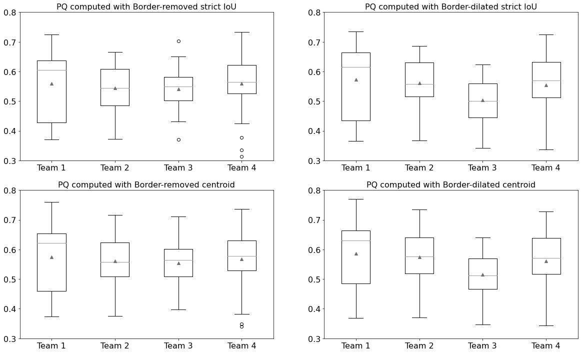
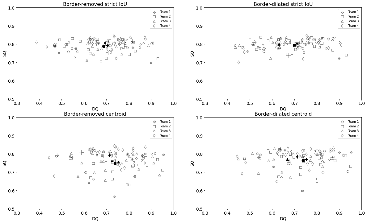
Table 1 details the PQ values computed from the n-ary masks generated using either the “border-removed” or “border-dilated” method, and matched against the ground truth using either the strict-IoU or centroid rule. The n-ary masks generated from the color-coded ground truth, also provided by the challenge, are similarly compared.
As we compare the ground truth to itself, the results of “color-coded ground truth” are not sensitive to the matching rule but are nevertheless surprisingly low. A small part of the error is due to the overlap problem previously mentioned: when restoring the n-ary masks, overlapping regions that are between the two borders (as can be seen in Figure 1) result in new, separate objects. A large part of the error is due to the IoU’s contribution to PQ and its strong sensitivity to small changes in the object size (as we discuss in section 5.1). Indeed, our necessary redefinition of the object contours leads to a decrease of about 9% in their size for the border-dilated version. The very small differences between the border-removed and border-dilated versions lead to an additional 2% decrease in the metric.
The results of the different teams show a few interesting things. First, the PQ can be clearly affected by a very small change in the shape of the objects. For a given matching rule, the differences between the border-removed and border-dilated n-ary masks are of the same order of magnitude as the differences between the teams themselves. The teams are not affected in the same way by these small changes, although the centroid rule always provides the highest PQ. Team 1 and 2, for instance, have their best performances in the “border-dilated, centroid-rule” condition. The best performances of Team 3 and 4, meanwhile, are achieved in the “border-removed, centroid-rule” condition. The rankings are therefore also affected, except for Team 3 which is consistently ranked last of the four. Finally, the matching rule only alters the ranking for the border-removed masks.
For a more objective analysis of these differences between teams, we can look at the PQ distributions on the 25 test patients. Figure 4 shows the boxplots computed under the different conditions. They show very similar distributions for Team 1, 2 and 4 in all conditions, with Team 3 only slightly different in the border-dilated cases. This is confirmed by Friedman tests which show no significant difference in the border-removed cases (p-values \(> 0.05\)). On the contrary, there are significant differences in the border-dilated cases (p-values \(< 0.005\)), where the Nemenyi post-hoc tests confirm that only Team 3 is significantly different from the others (p-values \(< 0.05\)). These data also show the interest to analyse metric value distributions over the test set in place of globalizing them in a sole averaged value per Team.
The PQ metric gives no indication whether a difference in score is due to weaknesses in the object detection or segmentation. Additional information can be obtained by examining the distribution of the SQ and DQ components, as detailed in Figure 5. An interesting pattern emerges in the “strict IoU” results (cf. top frames in Figure 5). As this matching rule excludes good detections with bad segmentations, the SQ distribution is very narrow, and almost all the differences in the PQ come from the detection performance. In the border-dilated strict IoU condition, we can see that Team 3’s segmentation score is as good as the others, but its detection score is smaller. The centroid matching rule admits detections with lower IoU, which leads to a much larger dispersion in the SQ (see bottom frames in Figure 5).
As shown above, we gain insight into the performances of the algorithms by examining the components of the PQ. In this section, we go one step further by computing separate metrics for the three tasks that make up the challenge: detection, classification and segmentation.
For the detection metrics, we look at the precision, recall and F1-score of cell nuclei detection computed per patient. As a reminder, this time we do not consider the nuclei classes at all, as they will be taken into account in the classification metrics. Figure 6 shows the distributions of the precision and recall obtained in the four conditions analyzed. The stability of the detection metrics is better than what we observed with the PQ, as the distributions are relatively well preserved across the four conditions, as well as the rankings of the F1-scores. This consistency in the results also appears when performing on the F1-scores the same statistical analysis as above on the PQ. This time, the Friedman test strongly rejects the null hypothesis of equality between the teams (p-value \(< 10^{-7}\)) in the four conditions, and the Nemenyi post-hoc shows significant differences between Team 3 and all others (p-value \(< 10^{-3}\)), as well as between Team 1 and Team 4 (p-value \(< 0.05\)) when using the strict IoU matching.
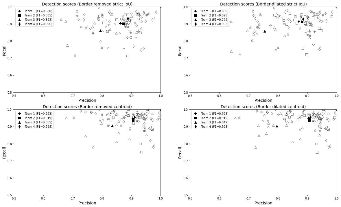
The balanced classification metrics extracted from the NCM are also informative. The overall accuracy and the per-class precision, recall and F1-score are reported in Table 2 for the border-dilated, strict-IoU condition. The three other conditions show very similar results and can be found in the supplementary materials. The accuracy distributions are significantly different between the teams (Friedman p-value \(< 0.05\)) in all conditions except the border-dilated, strict-IoU (detailed in Table 2). According to the post-hoc tests (p-value \(< 0.05\)), only Team 2 and 4 have significantly different accuracies when using the centroid matching rule, and only Team 3 and 4 in the border-removed, strict-IoU condition.
| Balanced classification | Team 1 | Team 2 | Team 3 | Team 4 | |
|---|---|---|---|---|---|
| Accuracy | Overall | 0.89±0.07 | 0.92±0.07 | 0.91±0.09 | 0.86±0.12 |
| Precision | Epithelial | 0.862 | 0.787 | 0.884 | 0.751 |
| Lymphocyte | 0.811 | 0.913 | 0.894 | 0.832 | |
| Neutrophil | 0.895 | 0.890 | 0.952 | 0.885 | |
| Macrophage | 0.991 | 0.888 | 0.973 | 0.933 | |
| Recall | Epithelial | 0.956 | 0.979 | 0.984 | 0.952 |
| Lymphocyte | 0.985 | 0.952 | 0.930 | 0.956 | |
| Neutrophil | 0.703 | 0.824 | 0.839 | 0.691 | |
| Macrophage | 0.852 | 0.885 | 0.838 | 0.768 | |
| F1-Score | Epithelial | 0.881 | 0.813 | 0.923 | 0.779 |
| Lymphocyte | 0.884 | 0.926 | 0.885 | 0.876 | |
| Neutrophil | 0.731 | 0.801 | 0.874 | 0.710 | |
| Macrophage | 0.907 | 0.849 | 0.874 | 0.791 | |
The per-class metrics show that teams generally have better precision for the macrophage and neutrophil classes (except Team 2), and better recall for the epithelial and lymphocyte cells. Looking at the F1-scores, all teams are generally worse at classifying neutrophils, but otherwise have different “specializations.” Indeed, Team 1 is better in the classification of macrophages, Team 2 and 4 in that of lymphocytes, and Team 3 in that of epithelial cells. This insight is very interesting given the imbalance of the dataset. Team 1 and 4 in particular have very low recall for the neutrophils, which are underrepresented in the training set. The same trends can be observed in all four conditions analyzed, showing once again a much greater robustness for single-purpose metrics.
The full confusion matrices (including the background class labeled as \(\emptyset\)) are shown in Table 3 for the border-dilated n-ary masks and strict-IoU matching rule (for the other conditions, see the supplementary materials). They give further information on what kind of classification and detection errors are made by the teams. For instance, if the large detection errors of Team 3 are immediately apparent (see the “\(\emptyset\)” line and column), we can also see that Team 2 has a lot of false (positive) detections for the macrophage class, compared to the other teams.
| Team 1 | \(\emptyset\) | E | L | N | M | Team 2 | \(\emptyset\) | E | L | N | M |
|---|---|---|---|---|---|---|---|---|---|---|---|
| \(\emptyset\) | 0 | 1338 | 829 | 14 | 59 | \(\emptyset\) | 0 | 962 | 629 | 5 | 285 |
| E | 831 | 6098 | 260 | 8 | 12 | E | 824 | 6240 | 88 | 0 | 57 |
| L | 507 | 79 | 7214 | 2 | 1 | L | 500 | 162 | 7131 | 4 | 6 |
| N | 8 | 5 | 39 | 118 | 2 | N | 10 | 1 | 18 | 133 | 10 |
| M | 102 | 16 | 11 | 8 | 170 | M | 115 | 16 | 1 | 11 | 164 |
| Team 3 | \(\emptyset\) | E | L | N | M | Team 4 | \(\emptyset\) | E | L | N | M |
| \(\emptyset\) | 0 | 2932 | 1545 | 50 | 99 | \(\emptyset\) | 0 | 1035 | 770 | 10 | 13 |
| E | 1152 | 5960 | 96 | 0 | 1 | E | 690 | 6193 | 302 | 2 | 22 |
| L | 860 | 76 | 6864 | 3 | 0 | L | 349 | 179 | 7274 | 1 | 0 |
| N | 11 | 1 | 20 | 137 | 3 | N | 12 | 3 | 38 | 117 | 2 |
| M | 99 | 30 | 8 | 11 | 159 | M | 90 | 30 | 7 | 25 | 155 |
As it could be expected from the DQ/SQ decomposition, the segmentation metrics show less variation between the teams when using the strict IoU matching rule (see Table 4). The IoU distributions are significantly different (p-value \(< 0.05\)) between the teams in most conditions except the border-dilated, strict-IoU, but the (more conservative) post-hoc tests show that Team 4 is significantly different than all the others only in the border-removed, centroid-rule condition, and the p-values are barely significant. The HD, however, tells a different story, with highly significantly different distributions in all conditions (p-value \(< 10^{-8}\)), with Team 2 and 4 generally better than the others (Team 2 particularly for the border-dilated conditions, Team 4 for the border-removed conditions).
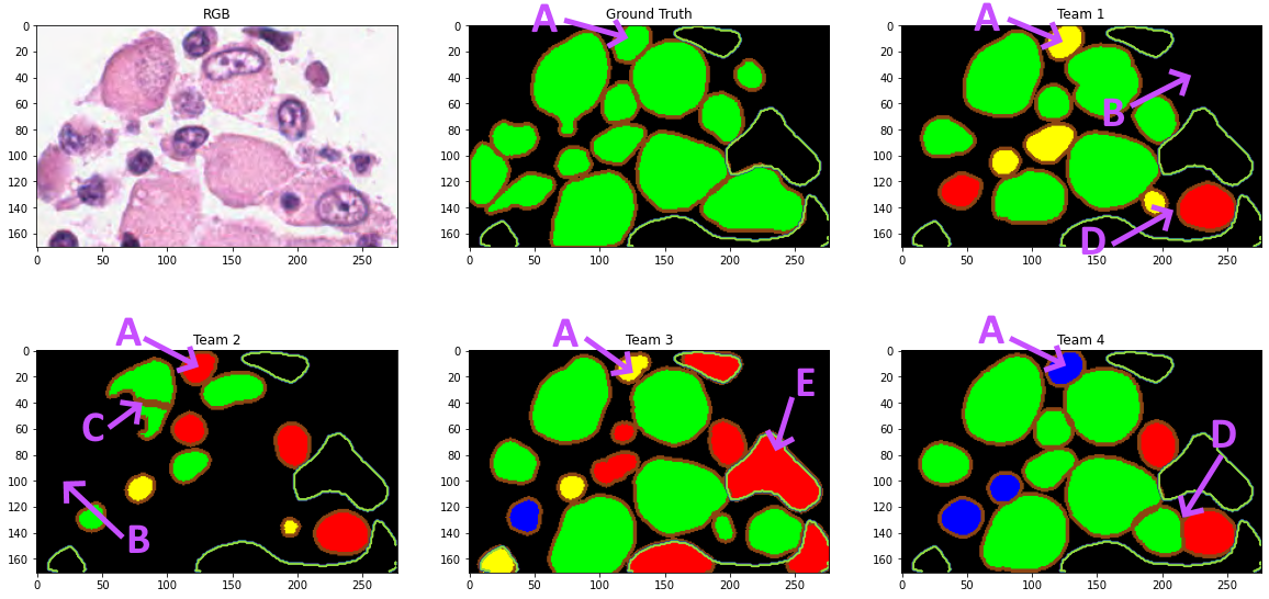
Additional information can also be extracted from the per-class segmentation results (full results provided in supplementary materials). For macrophages, for instance, Team 2 is consistently worse than the other three teams in terms of the IoU metric (and is at best ranked third using HD), while Team 4 is always the best. For all other classes, the IoU metric shows almost equal performances from all teams. In contrast, using the HD metric, Team 3 is consistently worse than all other teams on epithelial and lymphocyte cells, while all teams are nearly equivalent on neutrophils. An example of an image from the challenge with annotated macrophages and the color-coded predictions from all teams are shown in Figure 7.
| Average IoU | Border-removed | Border-dilated | ||
| Strict-IoU | Centroid | Strict-IoU | Centroid | |
| Team 1 | 0.786±0.03 | 0.744±0.07 | 0.799±0.03 | 0.761±0.07 |
| Team 2 | 0.785±0.03 | 0.744±0.07 | 0.795±0.03 | 0.762±0.05 |
| Team 3 | 0.788±0.03 | 0.741±0.06 | 0.795±0.02 | 0.751±0.05 |
| Team 4 | 0.800±0.03 | 0.771±0.05 | 0.793±0.03 | 0.766±0.05 |
| Average HD | Border-removed | Border-dilated | ||
| Strict-IoU | Centroid | Strict-IoU | Centroid | |
| Team 1 | 3.759±0.70 | 4.425±1.11 | 3.742±0.72 | 4.344±1.09 |
| Team 2 | 3.588±0.57 | 4.097±0.81 | 3.602±0.56 | 4.051±0.78 |
| Team 3 | 4.471±0.98 | 5.242±1.34 | 4.470±0.94 | 5.334±1.43 |
| Team 4 | 3.453±0.60 | 3.814±0.82 | 3.702±0.57 | 4.075±0.81 |
The Panoptic Quality was introduced as a way to provide a single, unified metric for joint semantic and instance segmentation [15], with the authors arguing that using independent metrics “introduces challenges in algorithm development, makes comparisons more difficult, and hinders communication.” It is understandable that competitions would be tempted to use such a metric, as it makes it easier to produce a single ranking and thus declare a single winner to the competition. The objective of a competition, however, is not just limited to finding a competition winner, but is also to advance our knowledge of the tasks involved and of the methods that can help us to solve them. The ability to gather such knowledge from challenge results is impaired by the use of unified, entangled metrics, as they make it much harder to determine the reasons for (the presence or absence of) differences in performance from one algorithm to another.
The comparison between the n-ary masks generated from the “colour-coded” ground truth with the “true” masks retrieved from the .xml annotations (Table 1) provides a good illustration of these difficulties. Indeed, the decomposition of the PQ value (of around 0.9) into Detection and Segmentation Quality shows that DQ is almost perfect (0.986 in all condition) aside from the minor errors due to the overlap problem mentioned previously, while SQ ranges from 0.905 (border-removed) to 0.925 (border-dilated). However, the same PQ score could be achieved with a 0.9 DQ and an almost perfect segmentation : in my PhD public defense (see annotated slides, page 21) I show a synthetic, amplified example of this problem, comparing a 0.5 IoU x 1.0 F1 score prediction to a 1.0 IoU x 0.5 F1 score, which would both have the same PQ despite the latter being a lot less useful for any application. --AF .
While it may be argued that combining both is a good thing if we want to encourage algorithms to focus on more than just one aspect of the task, this combination also implies that a 0.1 decrease in average IoU is “as bad” as a 0.1 decrease in the F1-score (see Equations [eq:sq], [eq:dq] and [eq:pq_dq_sq]). This statement seems more difficult to defend. Indeed, if we compute the IoU between two very similar objects, such as two squares centred at the same point but with sides of length \(l\) and \(l+2\), we have \(IoU = \frac{l^2}{(l+2)^2}\). Unlike the HD value which is constant (\(=\sqrt{2}\)), the IoU value can therefore vary greatly depending on the size of the original object, whereas the error is very slight and could be due to a small difference in the annotation software’s rasterization process, or to an annotator’s habit of drawing an “inner contour” rather than an “outer contour.” Other metrics will have their own biases and peculiarities, which makes it even more important to report them separately so that the causes of the scores’ differences can be clearly attributed.
A summary of the significant differences between the teams according to the detection, classification and segmentation metrics is presented in Table 5. The main conclusions that can be drawn from this analysis are that Team 3 is consistently worse than the others at overall detection and segmentation (using the HD metric). Meanwhile, there are no significant differences in any of the results between Team 1 and 2, and Team 4 is consistently better than the others at segmentation according to IoU and, often, HD. The only significant difference in the classification accuracy is between Team 2 and 4, with Team 4 consistently worse than Team 2. While not addressing class-specific aspects, these conclusions are already much richer and more nuanced than those that can be extracted from a ranking as presented in Table 1 (e.g. the "dilated border, strict IoU" column close to the original challenge). Indeed, the fact that Team 1 and 2 are equivalent and that Team 4 can be superior for segmentation is completely overlooked. Per-class results provide additional information which, for example, sheds light on differences in specialization between Team 1 and Team 2.
Additionnally, using statistical tests on the distributions of results on the test set instead of only considering the average value is necessary to determine if observed differences are significant and should count in the rankings. Teams with no significant differences - such as Team 1 and 2 in this case - should be ranked ex aequo. Rankings that include this statistical robustness would be less likely to be subject to the instability observed in previous challenges [4].
The main drawback of using disentangled metrics is that declaring a challenge winner (which, often accompanied by a prize, is a powerful incentive to motivate researchers to work on the task) becomes less obvious. Several different approaches are available to challenge organizers. The first is to rank the performance separately for each identified subtask, and to split the prize accordingly. The second is to compute the final ranking based on the sum of ranks obtained on the subtasks (as was done, for instance, in the GlaS 2015 challenge [17]). The third is to split the competition and the scientific knowledge aspects. This could involve using a complex metric, like the PQ, only for the challenge ranking, while reporting the results with the disentangled metrics (or enough information to compute them) alongside, and to focus the analysis of the challenge results on those more informative measures.
| Team 1 | Team 2 | Team 3 | Team 4 | |
|---|---|---|---|---|
| T1 | No significant difference | \(>\) Detect. (F1), \(>\) Seg. (HD) | \(<\) Seg. (IoU, HD) | |
| T2 | No significant difference | \(>\) Detect. (F1), \(>\) Seg. (HD) | \(>\) Class. (Acc), \(<\) Seg. (IoU) | |
| T3 | \(<\) Detect. (F1), \(<\) Seg. (HD) | \(<\) Detect. (F1), \(<\) Seg. (HD) | \(<\) Detect. (F1), \(<\) Seg. (IoU, HD) | |
| T4 | \(>\) Seg. (IoU, HD) | \(<\) Class. (Acc), \(>\) Seg. (IoU) | \(>\) Detect. (F1), \(>\) Seg. (IoU, HD) |
Our study has two major limitations. First, as we rely on a possibly imperfect reconstruction of the original (unpublished) prediction masks, we cannot draw conclusions about the algorithms with certainty. Second, the previously mentioned fact that the published challenge results are incorrect [16] means that there may be a selection bias on the teams whose results are available for analysis. There may therefore be other participating algorithms that performed better (for PQ or untangled metrics) but could not be included in our analysis. Due to lack of available data, our study is therefore more a demonstration of the type of insights that can be gathered by further analysis of the results of a challenge, outside the constraints of having to declare a single winner, than actual insights on the algorithms participating in the MoNuSAC challenge.
The decision by the MoNuSAC challenge’s organizers to publish the predictions of some of the teams provides a great opportunity for other researchers to go beyond the surface-level information given by the challenge metric and results. As noted in previous reviews of challenges [4], [12], this level of transparency is unfortunately rarely seen in such competitions. Our own analysis of the available results show that many potentially useful insights are hidden by the computation of the single PQ score. Complex tasks such as the one proposed by MoNuSAC are composed of distinct subtasks. Each of those tasks (detection, classification, segmentation…) can be assessed by many different metrics, each with its own biases and limitations. While such complex tasks are more closely related to the needs of pathologists [12], it is clear that their evaluation is also more complex. It is certainly unreasonable to expect challenge organizers to compute all possible metrics and to think about extracting all the information that might be of interest to other researchers. However, limiting the published results to a single entangled metric severely restricts the usage that can be made from those results beyond announcing a “challenge winner.” It also encourages future researchers (and future challenges) working on the same problem to restrict or focus the evaluation of methods to the use of the same metric, so as to compare their solution to the challenge’s results. The PQ was introduced for nuclei instance segmentation and classification by Graham et al. in 2019 [18], and has since been adopted by several publications on instance segmentation in digital pathology [19]–[21]. It is also the metric chosen by the Colon Nuclei Identification and Counting (CoNIC) 2022 challenge [22].
Publishing the raw predictions provided by participating teams and the ground truth annotations along with the challenge results is an excellent way to make the most out of the work of the teams and the organizers. This publication allows for “crowd-sourcing" the analysis of the results and extending the usefulness of the challenge to use cases that were not foreseen by the organizers. It is also essential for the reproducibility of the results and to reduce the dependence on the particular implementation of the chosen metrics by the organizers. Indeed, many metric computations come with arbitrary choices (from the exact definition of a “matching rule” to the way missing values are handled or values are aggregated), some of which are sometimes not precisely described in the challenge publications. The only way to ensure the validity of the results, and/or to allow for valid extensions and benchmarking at a later stage, is for the predictions provided by the participating teams and the source code of the evaluation metric to be publicly available.
Another important point made possible by increased transparency is to allow testing the robustness and stability of the chosen metrics. As our results show, small changes in the prediction masks can affect the ranking of certain performances and even the identification of statistically significant differences between these performances. Disentangled metrics tend to be more robust to these changes, as a particular change may only affect some of the metrics. For instance, in this study we show that mask dilation will mostly affect segmentation metrics (as expected), but not detection and classification metrics.
It is therefore highly desirable to go one step further and not limit the publication of prediction masks to the “top" teams for a particular metric, to avoid selection bias on any other insight that can be extracted from the challenge. The more transparency there is on challenge results, the more collaborative work is possible and the more value can be extracted from all the hard work of organizing challenges, annotating data and developing solutions by the participants.
C. Decaestecker is a senior research associate with the National (Belgian) Fund for Scientific Research (F.R.S.-FNRS) and is an active member of the TRAIL Institute (Trusted AI Labs, https://trail.ac/, Fédération Wallonie-Bruxelles, Belgium). A. Foucart thanks the Université Libre de Bruxelles for extending the funding for this research to offset COVID-19 related delays.